View full version
on your desktop device
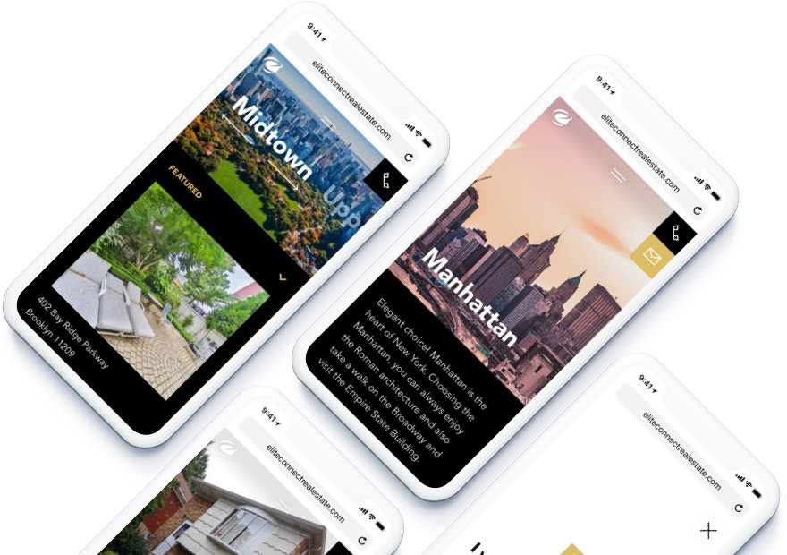
Real estate
website rebranding

About project
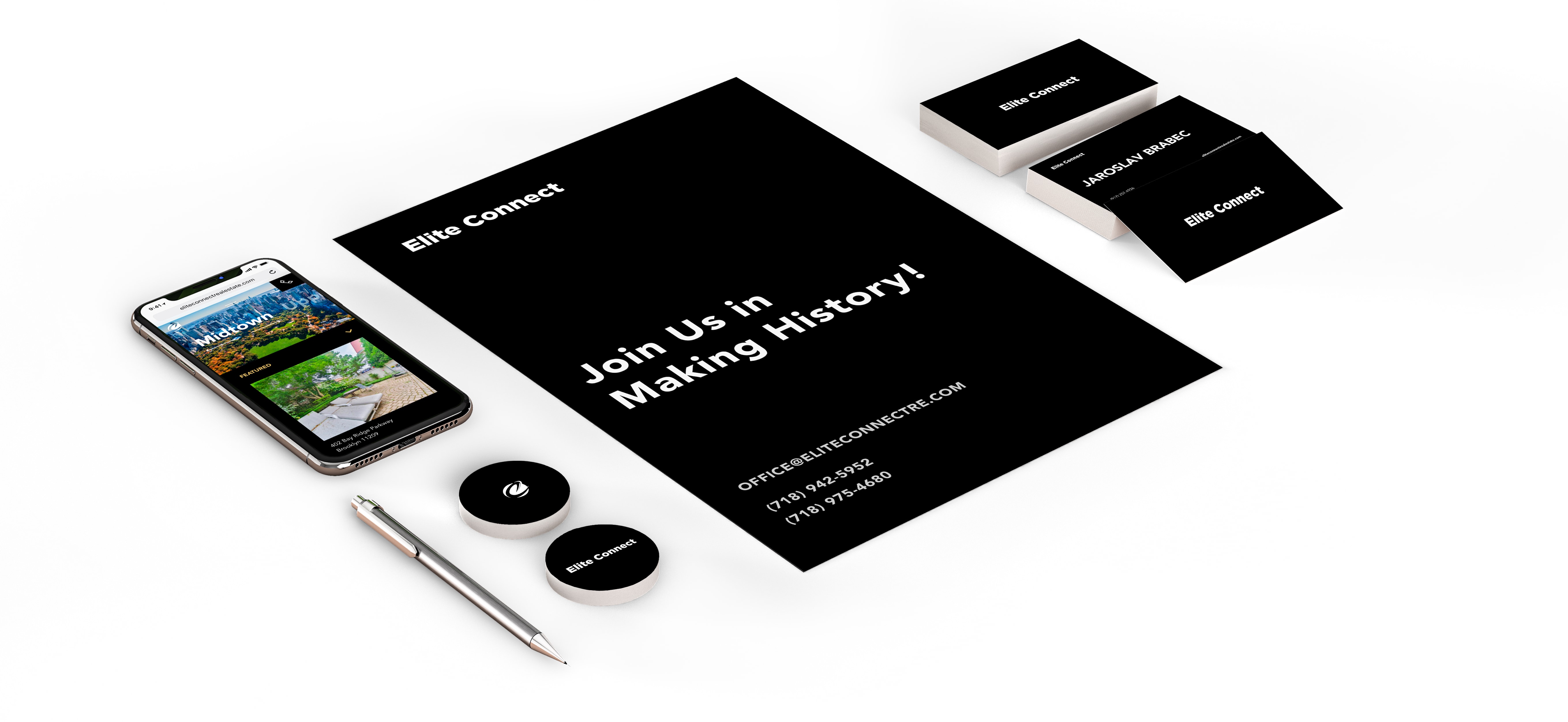
It was important for us to get this client, so we made slides with a refreshed brand concept.
The original golden color was replaced with more reach gold.
This website was made as a temporary solution. Meantime our team was involved in a secret project; all team was involved in making real estate websites look like not real estate websites. This was the main point that client provided to us.
 About
AboutWorkflow
Goals
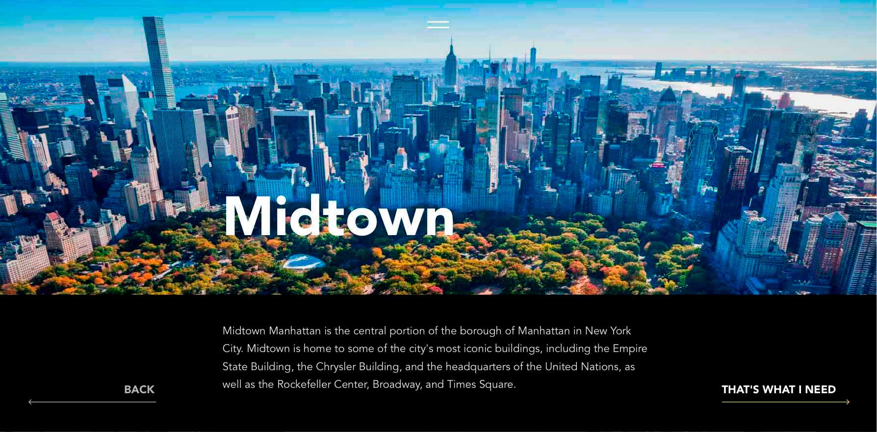
The goal was to move users through the website by separating user stories on Buyers, Investors, and Agents.
The main focus was on buyers, so we developed flow for NY Areas and properties.
Colors used
 White Smoke #F3F3F3
 Black #000000
 Chenin #DCBD66
 Husk #B09752
Typography
Avenir Font
ABCDEFGHIJKLMNOPQRSTUVWXYZ
abcdefghijklmnopqrstuvwxyz
Avenir Black font 80px
Avenir Black font 32px
Avenir Black font 22px
Avenir Black font 16px
Logo
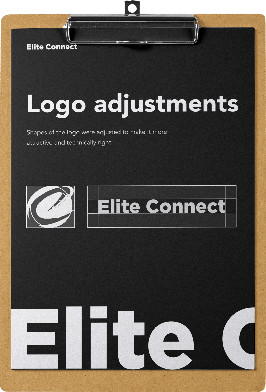
Shapes of the logo were adjusted to make it more attractive and technically right.
CRM
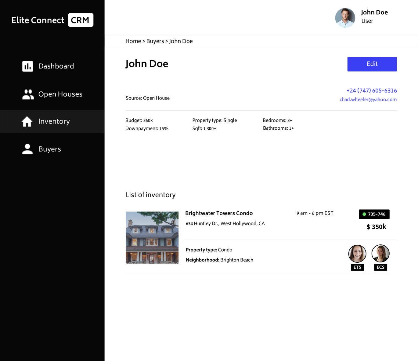
We had a strong plan about the structure and prepared application section by section, first was buyers than real estate sections, now they work as modules that can be enabled and disabled in the system.
There was a complex task about logic and how the customer will interact with the system so our client can collect all the needed information without any issues.
Result
Website is completed and pretty unusual for real estate websites: navigation, user flow, and interactions, including navigation and contact form. We tried to create here completely new experience for people who want to buy a house, and we think we did it.
Have a project or idea that you want bringing to life - let’s make some magic together!
Contact Us