We live in a digital world, and the number of mobile app downloads worldwide has constantly been increasing from 2016 onward, surpassing 200 billion in 2019. In the most recently measured year, consumers downloaded 255 billion mobile apps to their connected devices, up by more than 80 percent from 140.7 billion app downloads in 2016. Our team has been developing and designing digital products for over 6 years, and we are convinced that easy-to-use apps with great mobile UX are the most useful mobile apps people find gripping.
As per a Statista report, at present, there are almost 2.22 million iOS apps and more than 3.48 million Android apps. However, you don’t find all these apps compelling, right?
Hence, making a compelling App design is a priority for designers. Especially for mobile-first companies where the user app experience is the main way customers interact with a brand.
If you have ever worked on a mobile application or have worked with a design team, you know that poor UX results in application uninstall. That’s why it’s important to design your app to ensure it’s usable, intuitive, and enjoyable. This article will help you understand everything about mobile UX and how to improve App user experience with 10 best practices.
1. Keep your App design simple
The users of your application have certain goals in mind, and if they find an obstacle, they may get frustrated or spend more time than expected, losing their way. Similarly, your mobile app’s unwanted features will only lead them away from their goal. Thus, you should have a minimalistic design approach to create a simple and highly usable mobile application.
The principle of minimalism is keeping things very simple. However, “very simple” does not mean that design should be boring, primitive or monotonous.
This means:
– Minimum cognitive load
– Maximize usability
– Minimum actions
– The logic of all actions
– Simple actions & design
The great design of a mobile application should be based on the principles of functional minimalism: laconic graphics, enough space between elements, and a harmonious color scheme.
Here is an example of mobile UX design from our portfolio — Dials App.
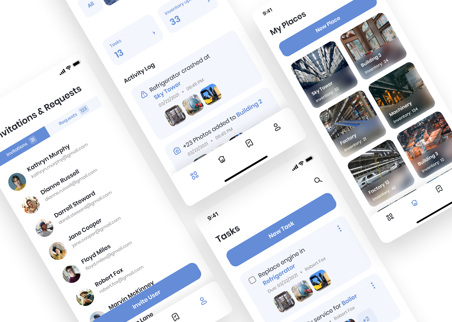
“Great communities run on Dials. In addition, Dials are reinventing the way HOAs are being managed by automating the collection, reconciliation, and compliance.”
People often say a picture is worth of thousand words. However, the human brain processes images much more effectively than words alone. So our goal was to create a clean mobile UX design and combine text and images harmoniously.
As a result, Dials’ website and mobile app are great examples of a clean layout. The white background makes the information with pictures readable and well-organized. In addition, the blue and pink tones are calming, evoking trust and confidence in the brand.
2. Make your App intuitive and consistent
The interface should lead users from step to step because the less the user thinks about how to use your app, the better.
The unique content and features are only useful if your users can find them. So, implement easy-to-find elements so users can navigate from one screen to another or return without issues. Also, design the navigation menu so it only occupies a little space on the screen.
3. Interaction with your App
How people hold and interact with their phones.
Designing navigation is only possible by understanding user interaction with a mobile device. Different application tasks require different ways of interacting. Also, people hold the phone differently, depending on the situation.
You should also consider the bottom navigation trend. It is shifting the user interface down. The most well-known research on how users hold and operate mobile gadgets — is by Steven Hoober and Josh Clark.
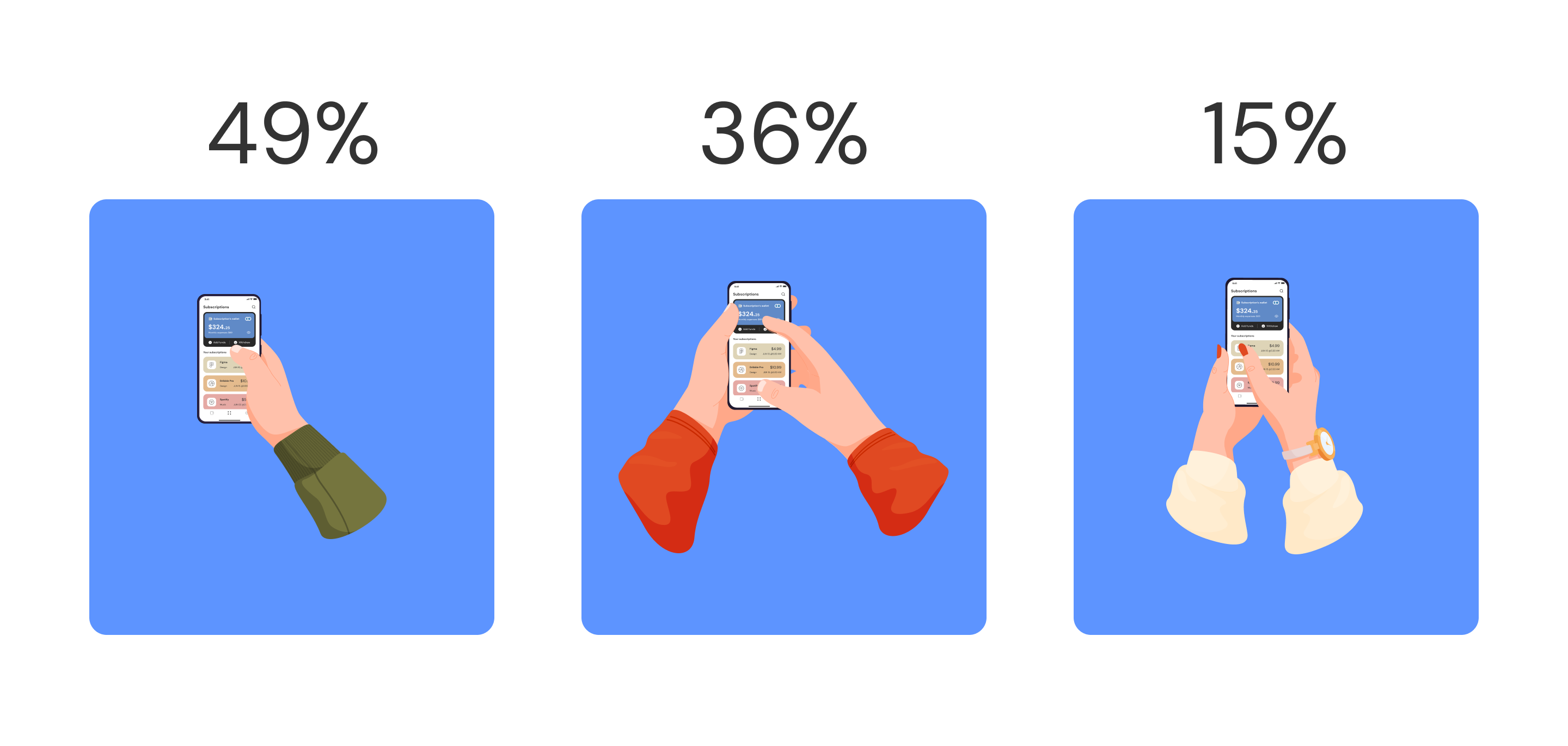
Three basic handholds define smartphone use, and we often shift among them. Interaction with one hand.
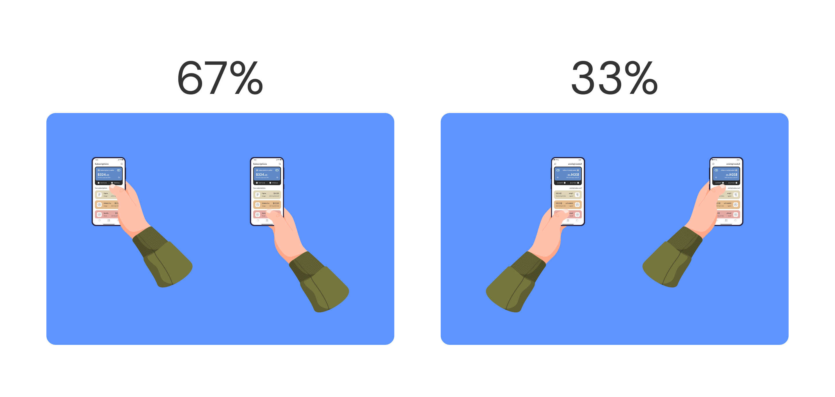
Using Gestures
There are certain habits that users have when they use their smartphones. To deliver a superior experience with your mobile App, you should respect those habits and use them.
For example, iPhone users can go back by simply swiping from the left side of the screen to the right side of the screen, and therefore, in your App, you should include the back button on the left top, but along with that, your App should also be able to use this gesture.
Various other gestures include pinch to zoom, two fingers, 3D touch, etc. You should have it in your App to deliver a better user experience.
Animations
Animations and other visually appealing tidbits always catch the attention of the human eye. It also makes an app fun to use. Create a seamless flow of animation to follow the action on the App, like a long press on a menu option, for example. Animations can also be used effectively to draw the user’s attention to action, leading to an overall memorable experience for the user.
Gamification
The best way to motivate the user is to add game mechanics if they match the App goals and the audience. People enjoy challenges and entertaining aspects, all of which enhance the User Experience of the mobile App.
4. Blurring technique
The method helps to understand what the user will see at first glance and check the accents.
Let’s take a look at the “blurred” screen as an example. It looks like you need to select some option and then press the red button. However, the original design looks like this.
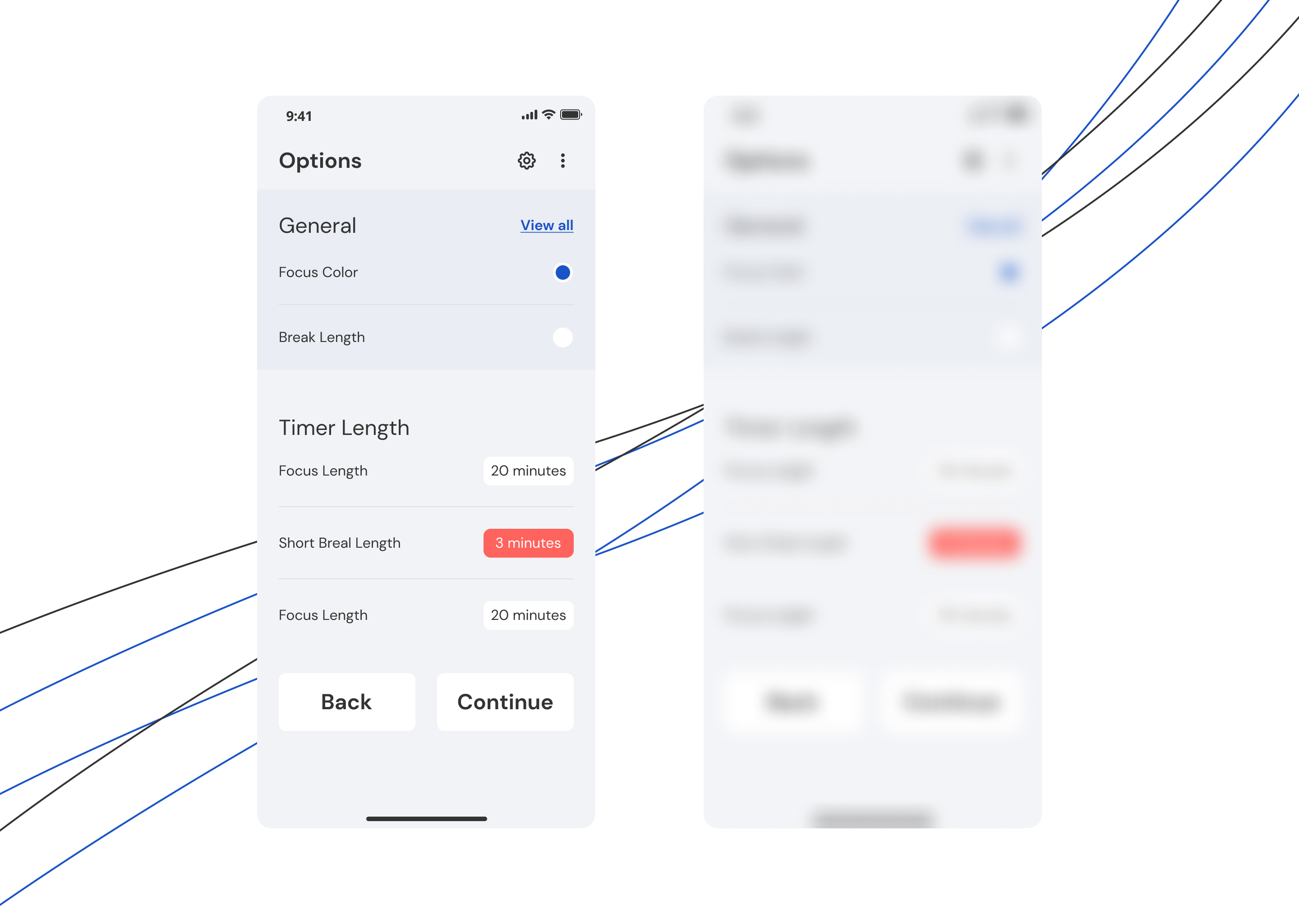
This means that the accents are put wrong; this way, the users are disoriented.
With the blur method, it is easy to check the user interface and, notice primary and secondary elements, add accents if needed.
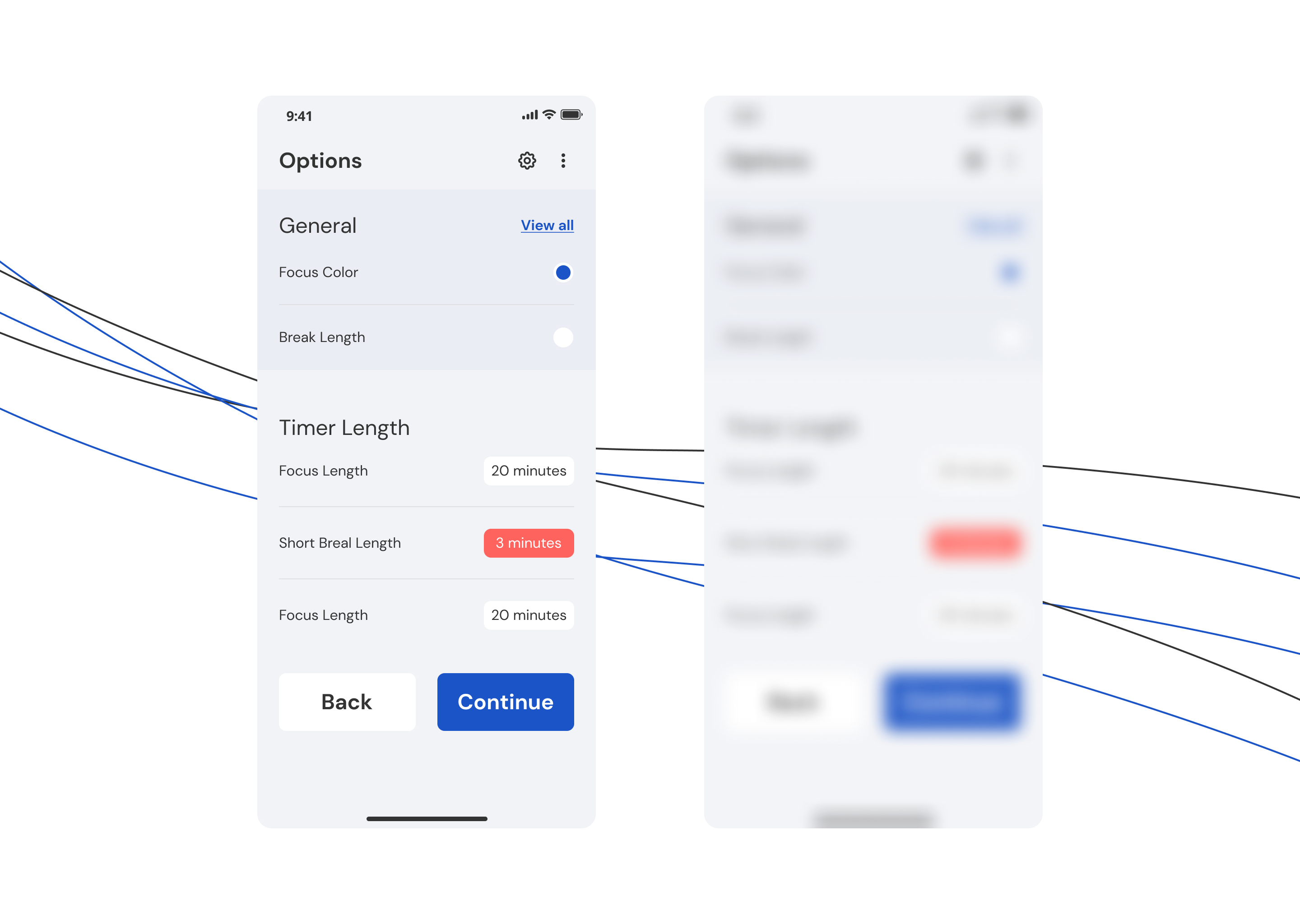
To make important elements of the interface look clear and read even in poor lighting, it is necessary to use the principles of contrast.
5. Mobile form design
The primary goal with every form is completion, right? So, you need to make filling out a form as easy as possible and lead the user to the end.
Avoid long forms and strive to create fast and frictionless interactions when designing a form.
You aim to reduce the user’s effort to input during the form filling. Make it as easy as possible for users to complete a task and consider using autofill and reducing the number of fields the user needs to fill out.
Here are some tips,
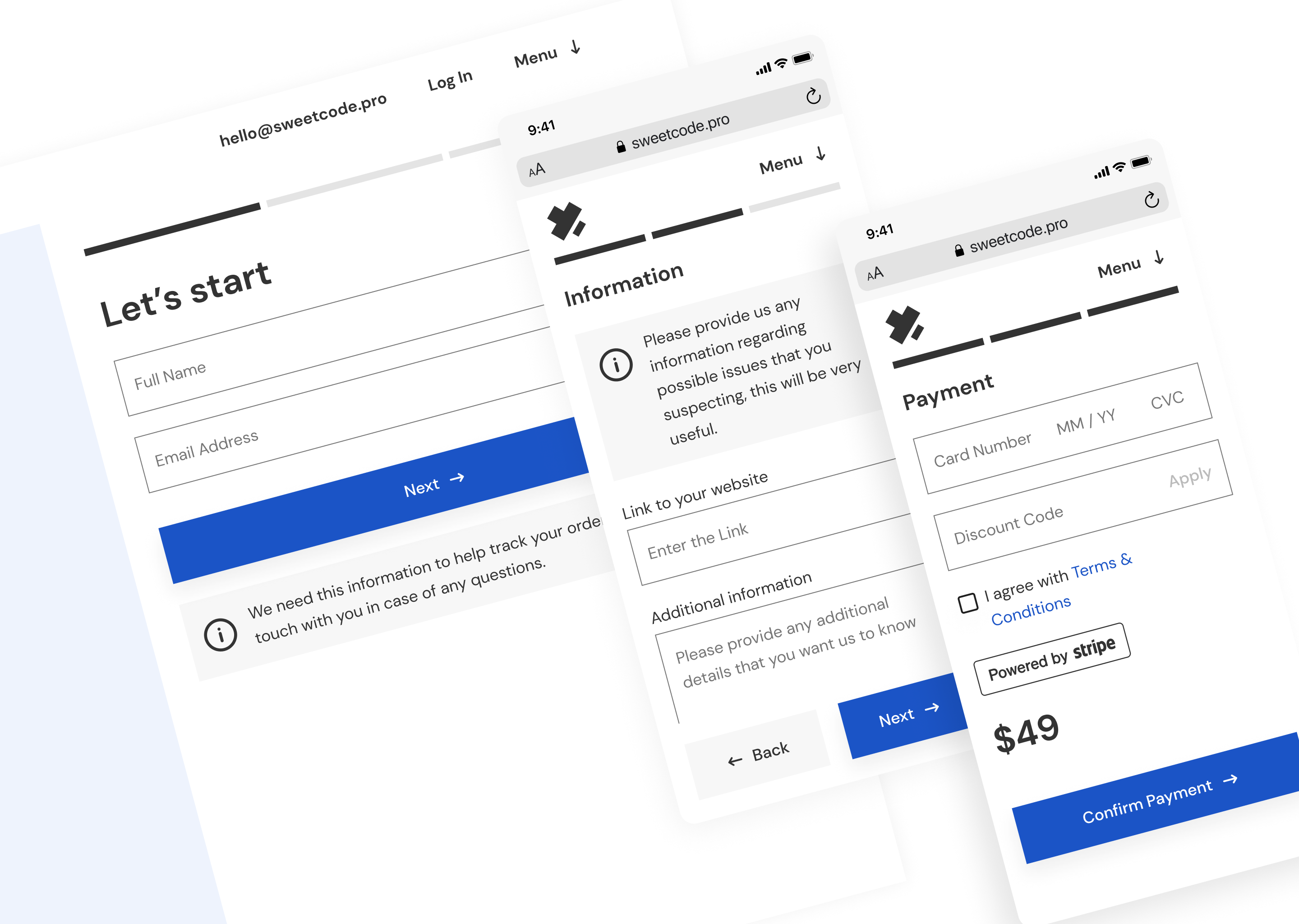
– Divide large forms across several screens to be filled out step-by-step
– Add only necessary information in the forms
– Use autosuggest, “forward” and “back” thumb buttons to speed up and simplify the filling-out process
– Don’t use scrollbars
Here is also an example of our work — Express UX audit order form.
6. Collect direct feedback
To have a perfectly customized and tailored mobile application with great UX, the most crucial step is to realize the needs and requirements of the user. Collecting tips and trustworthy feedback from the mouth of the customer around elements of their UX that they’re satisfied and unsatisfied with is the most reliable way to understand the improvements your app needs.
One of the ways to collect feedback is an in-App survey, a short version of a traditional survey embedded directly in the app experience. In-App surveys provide a direct line of communication with your customers. This information will help you decide what to change and improve.
Also, pay attention to reviews on Google Play or Appstore. After analyzing the feedback, you will receive information that will help you decide what to change and improve.
For example, we analyzed feedback on one of our internal projects — BAU5. And here are some conclusions that we made based on the information received.
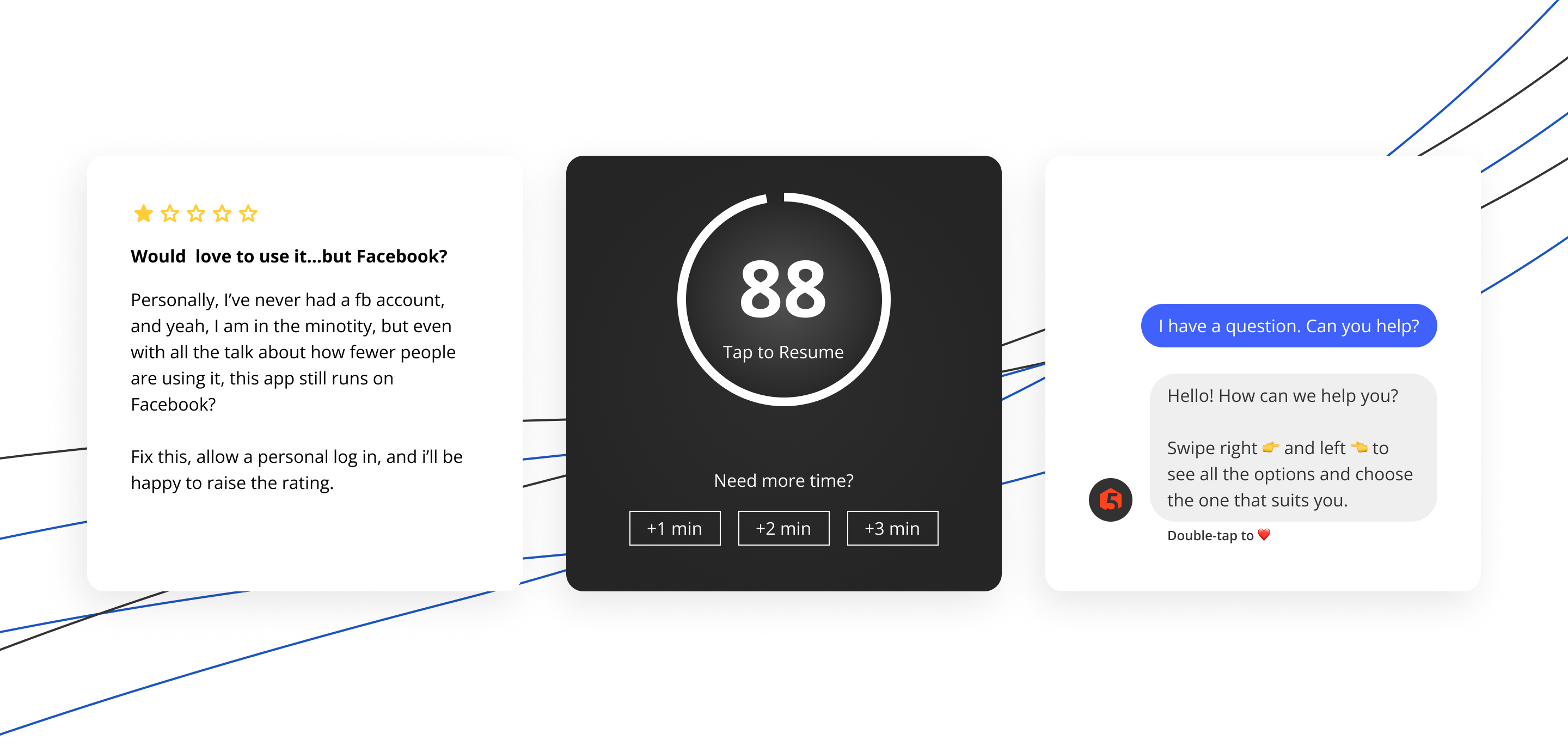
Remove “Sign up with Facebook” from the app. User feedback in the App Store helped us with a competent UX audit. We analyzed all reviews and information on why you should not register through Facebook and concluded that it is worth removing this cooperation. This is related to Facebook’s collection of people’s data, which should be kept confidential.
More time for rest. Since this is a fitness application, recreation is one of the essential features. However, some BAU5 users complained about having more time to rest, as they didn’t have time to find the necessary inventory in the large gym. Therefore, our developers want to add the option “+1 min”, “+2 min,” and “+3 min” so that a person always has time for both rest and equipment search. So keep in mind that meaningful UX feature in your audit.
Long response from the developer. We decided to automate the answer through social networks like Instagram or Facebook to solve this problem. Variants of the problem and their quick solution come automatically to the person via chatbot. If the problem is not listed, the user can ask a question and get a detailed answer within 24 hours.
7. Text
Texts in the application should be concise, simple, and legible.
Texts should be easy to read
For the text to be easily read without magnification, it should contrast with the background and have a letter height of at least 11pt. The font type, line spacing, and letter spacing also significantly affect text legibility. According to tech biggies like Apple and Google, you should keep the font at 12 points. It helps users read the info on the screen without zooming in. Moreover, it helps them keep their device at a comfort-giving distance for viewing.
Texts should be brief
Try to put only a little text into one screen. The shorter your text is, the better user will understand it.
Texts can be replaced with an image
It is better to replace the text with an image wherever possible. A short video or images are always better than long texts.
8. Increase speed
One of the most annoying moments for a user is when the mobile application takes too much time to load the screens and features. According to Google/SOASTA Research, if the App takes more than 5 seconds to load anything, it will increase your App’s bounce rate.
You can improve the speed by offloading the data, optimizing the images, lightering code, reducing plugins, using a cache, regularly updating your App, etc. Thus, you can speed up your mobile App. You should consistently monitor your App’s performance and optimize or fix issues as they arise.
9. Provide user assistance
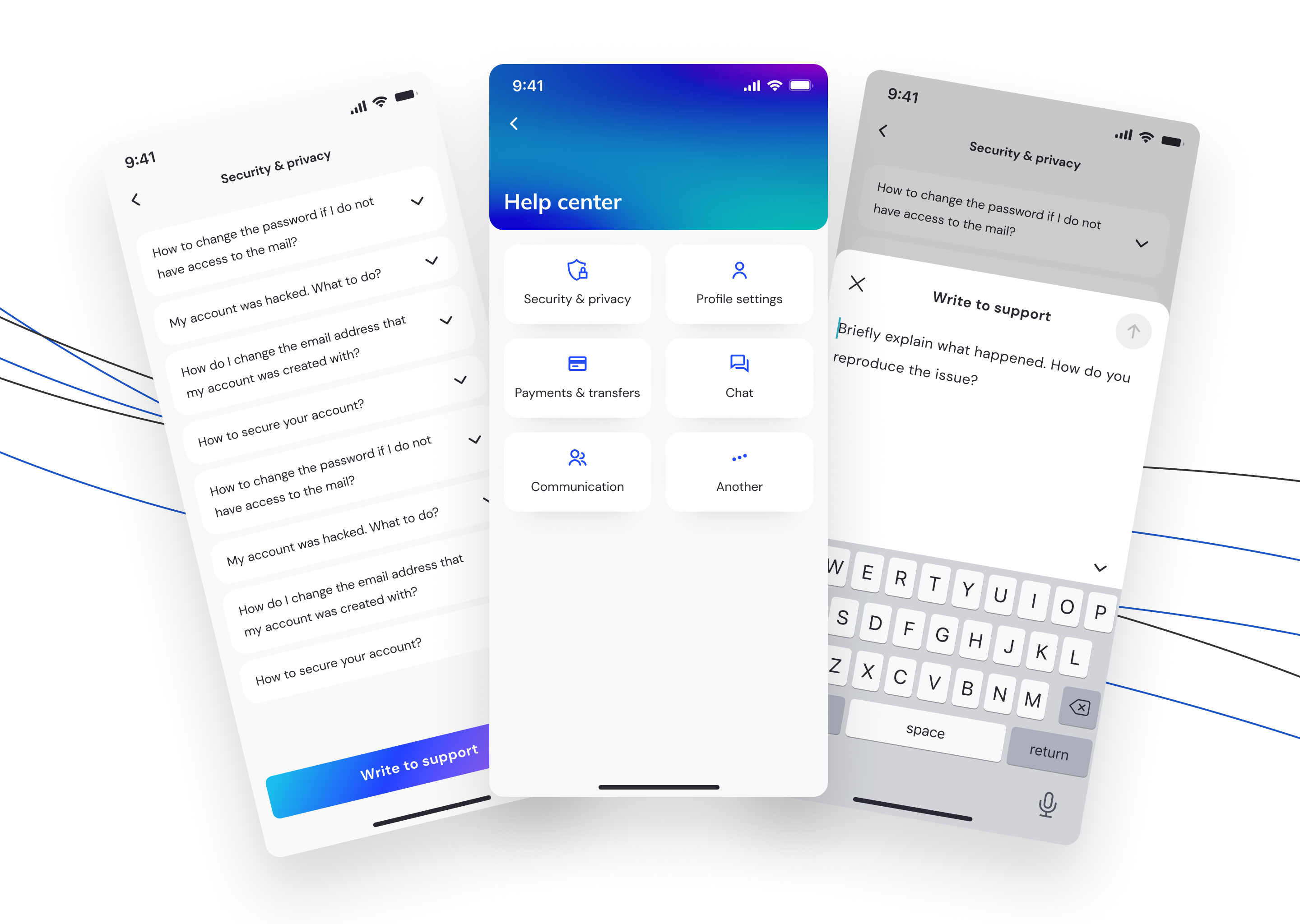
Providing user assistance is a simple yet overlooked element of the user experience. So make it easy for users to access help and support options. Users commonly look for help in the toolbar or menu of a mobile app. Also, you should offer multiple ways for users to receive support, such as self-serve FAQs, live support via click-to-call, chatbots, click-to-call client support buttons, and so on.
Here are some examples of user support in Apps our team has worked on.
10. Proper App testing
Before releasing your App, make sure you have multiple rounds of testing to ensure that it does not crash and does not have bags. Also, try to have user-level testing — the best way to check on the usability of your App is by testing it with your users. This process is referred to as remote testing.
The users taking part in the remote user testing will record their experience while using the App in their natural environment by using recording software. Or you can allow users to use the trial version of the App and give their valuable feedback so that you can improve your App before release.
Also, another great way to test your App is to conduct UX Audit. We know firsthand that running our website or application comes with many uncertainties and doubts. That’s why we’re introducing a brand new service — Express UX audit, developed specifically to help you find critical issues that impact your online business.
As a result of Express UX Audit, you will receive a comprehensive report with potential usability problems and flags on serious issues. That includes navigation issues, responsive design problems, colors, CTA positions, and how your website layout is good.
The design team will provide recommendations based on UX best practices for each issue identified in terms of an actionable plan.

UX Audit is a handy tool for those who want to identify usability problems in their digital products. UX audit detects 90% of usability issues in your App or website. You can order a usability audit by filling in the form.
Don’t give users reasons to uninstall your App.
To make people use your application, provide them with the best user experience by enhancing usability and design. And optimize mobile UX continuously so your users remain loyal and satisfied.
So, follow the tips mentioned above, and feel free to contact us if you need professional product design help. Our team is passionate about intuitive UI and outstanding user experience. We’ve helped to build a number of startups in various industries from the ground up, and we know how to make YOUR business idea succeed.
Ready to make your product better with us? We are happy to hear you out at hallo@sweetcode.pro