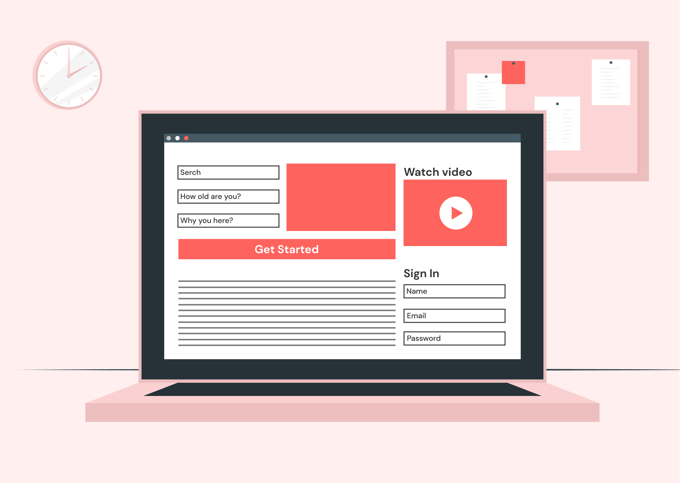
We have already talked about taking your landing page from good to great, and we hope you got this. Today we will talk about the main things which are killing a great landing page and high conversion to your website.
By the way, have you already prepared your website for the Holiday Season? If you want to get people into the holiday spirit and encourage them to buy from you, start by sprucing up your homepage with some holiday decor. As we did, don’t miss our gifts for you.
So, we know that every dollar wasted is a dollar you can’t spend growing your company for you as a business owner or a startup. So what are the most common mistakes made on landing pages?
1. Mindlessly following trends
Yes, you have probably read more than one article or post about design trends in 2021. Of course, it’s excellent to improve and know about trends! But don’t forget that the primary purpose of a landing page is to sell a product or an idea. And it is about selling a product — not about getting thousands of likes from other designers.
The way your landing page looks should be determined by what your target group is, not by what’s popular right now on Dribbble.
Think about the characteristics of your product. What style, colors, and imagery would suit it the most?
2. Too many distractions
Many people believe that users should have the right to choose. Choosing more is a better choice, but on a landing page with a specific goal, the choice is not right. We live in a focused economy, and too many choices will stifle the ability to make decisions. Every additional element you add to the page reduces the importance of all other elements on the page. By reducing distractions, you can focus on the essential items.

3. Too many calls to action (CTA)
The goal of a landing page is to provide potential leads with a single action to take. It makes it as obvious as possible what they should do. Many marketers like CTA so much that they try to add more than one to the landing page. But as we have already shown in the second mistake, too much distraction can make your conversion low. The best way is to use only one CTA on your landing page.
4. Speed is a killer

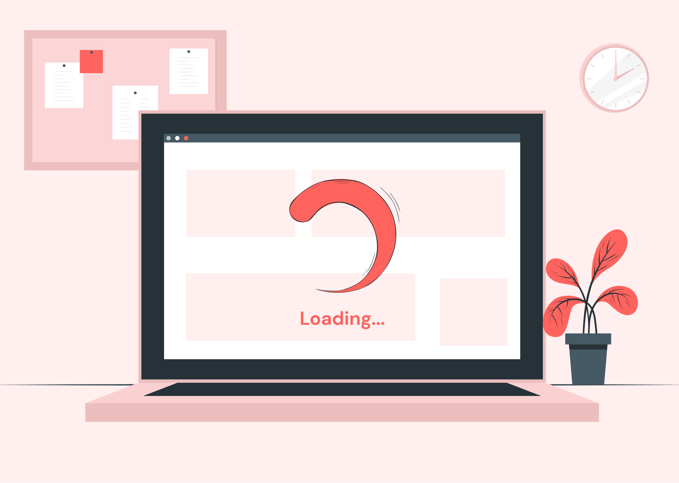
An obvious problem, but it occurs quite often, even now. You’ll lose out on sales and traffic if your site loads slowly. Thankfully, it isn’t that hard to improve. There are plenty of tools, tips, and tricks you can use to help your site load faster and improve traffic and search engine rankings.
Here’s a quick checklist to use to ensure your pages are loading as fast as possible.
1. Check your image size. Images bigger than 800kb could be slowing your page load time. Optimize/compress your images to reduce their size.
2. Be strategic with the inclusion of images on your pages.
Only include the necessary images. Each image creates its own HTTP request and adds size to the page, thus adding total load time.
3. Reduce font families/weights because each font/weight adds to page load time.
4. Be mindful of how many HTTP requests are being made on your pages.
Reduce the number of HTTP requests because they’re for external resources (external scripts, stylesheets, images, etc.)
5. This one’s a biggie: optimize your custom scripts.
5. You want too much
Look, you have fixed all the above problems, and potential customers are ready to fill out the form, but…your form is complicated. So what should you do? Try to weigh the trade-offs; there may be some form fields, such as locations that can be automatically pre-filled.
Or maybe the first time you ask for the name and email address, and the second time visitors will come back, and you will have more details.
Your landing page should attract visitors to your website in every possible way. It should be visually attractive, but it should also satisfy the psychological aspect of trading. Continually testing the elements of the page will only promote better conversions. By avoiding these common mistakes, your campaign will have a winning landing page.
Feel free to send us an email – hello@sweetcode.pro if you want to implement your ideas!
