If you don’t have a great landing page, it’s like going fishing without a net. Maybe you can land a fish on your hook, but you won’t be able to drag it into the boat.
We will tell you how to drag people into your boat and increase conversion rates to reach your marketing or business growth goals.
Learn landing page logic, common mistakes, and tips with these 7 simple steps.
1.Your unique selling proposition (USP) + Call to action

Your unique selling proposition (USP) has to set clear expectations for your customers and pinpoints why you are the best offer for them.
And it’s not about elaborate features, but instead your one-of-a-kind brand promise that will solve your client’s problem.
Your USP needs to work alongside your Call to action.
The call-to-action must help clear up any user doubts, and the USP is not too long.
How does this look on a landing page?
– The main headline
– The supporting headline
– The closing argument
2. Product information
A compelling headline and hero shot get your customer’s attention, while the features section provides a little more detail and answers any remaining questions. Tell the user about your proposal using facts.
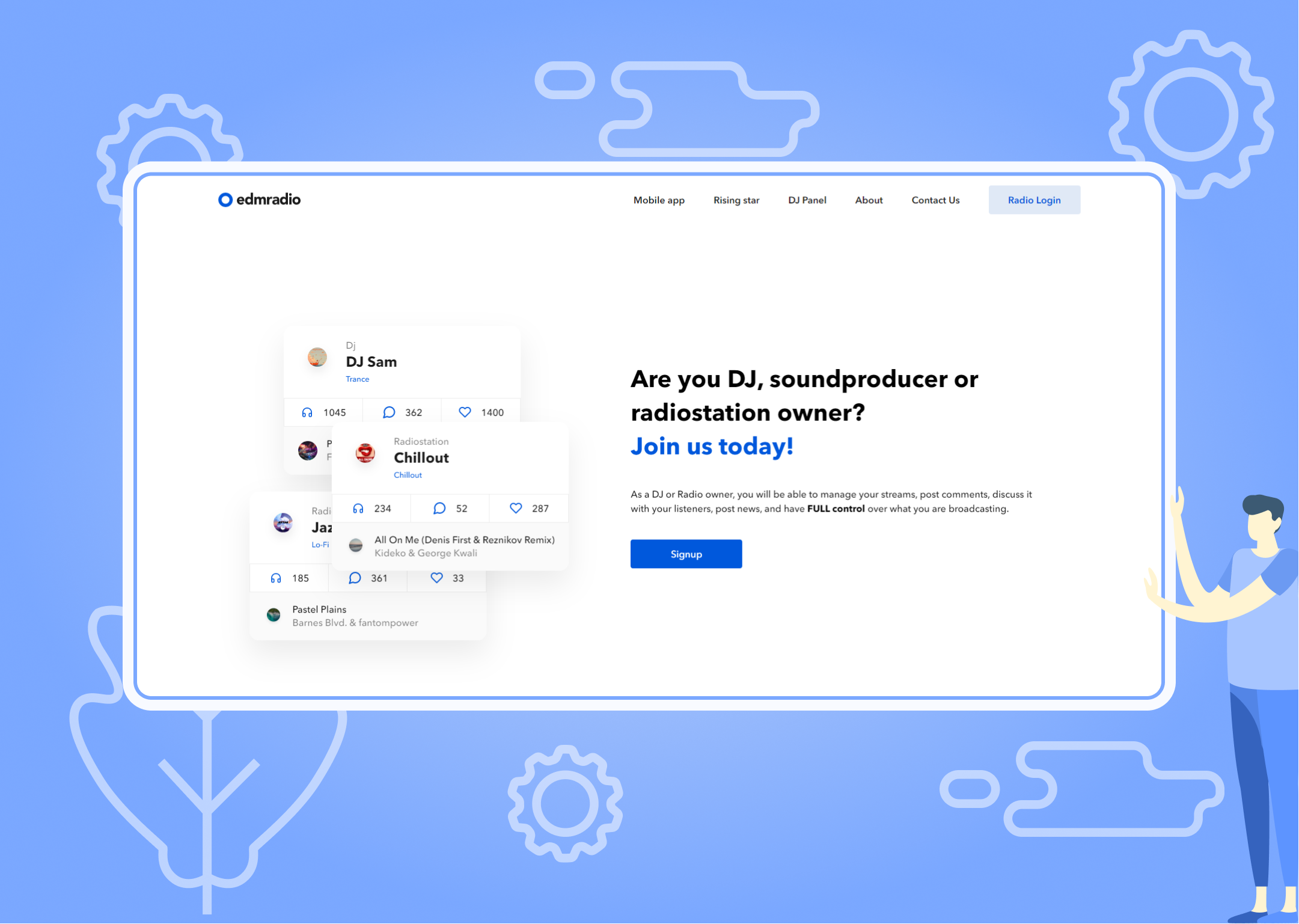
For example, the phrase we used in the example: As a DJ or Radio owner, you will be able to manage your streams, post comments, discuss it with your listeners, post news, and have FULL control over what you are broadcasting.

3.Your Features & Benefits
Here you tell why the user should choose your company. Remember: your features describe what your product or service does, while your benefits describe the value you’re providing.
The scheme is simple: a clear, catchy headline and listing the benefits. Before listing your features, try putting yourself in your customer’s shoes and answering: “How will this product or service benefit me?
Remember, you’re better off writing a summary of each (with a focus on value).
4. Offer
The next step is to tell you about your offer. In this block, the user should receive detailed information about the services.
You also can offer a free trial, a whitepaper, or a matching gift.

5. Cost (if your business deals with it)
After a detailed offer, you can show information about the cost and tariffs along with an order form, a brief, or a “buy” button if you have online payment.
6. Your Social Proof
Social proof uses social signals to illustrate that other people have bought, consumed, read, or participated in what you’re offering. The idea is that people are more likely to convert if they see that others before them have (and were glad they did).
Never take false reviews and photos. It reads and ruins everything.
7. Methods of Contact
Show how visitors can contact you.

Finish, where you need to put links to social networks and a feedback form. It is a crucial block that will reduce the bounce rate and provide an opportunity to collect contacts and remind those who did not decide to buy right away.
Increase trust by clearly displaying your company’s name or business and your contact details, including a Google map of your location (so Google can find it more easily) and links to your social networks.
The final step is to look at your landing page as a buyer. Take a critical and fresh look at the page’s structure and evaluate how clear the information is presented and whether there are no logical errors.
To sum up: be clear about what action you want the visitor to take and make it as easy and compelling as possible for them to take it. The visitor is your priority.
You know you can contact us for a winning landing page? Feel free to send us an email – hello@sweetcode.pro. You, too, will soon have a landing page that converts!
