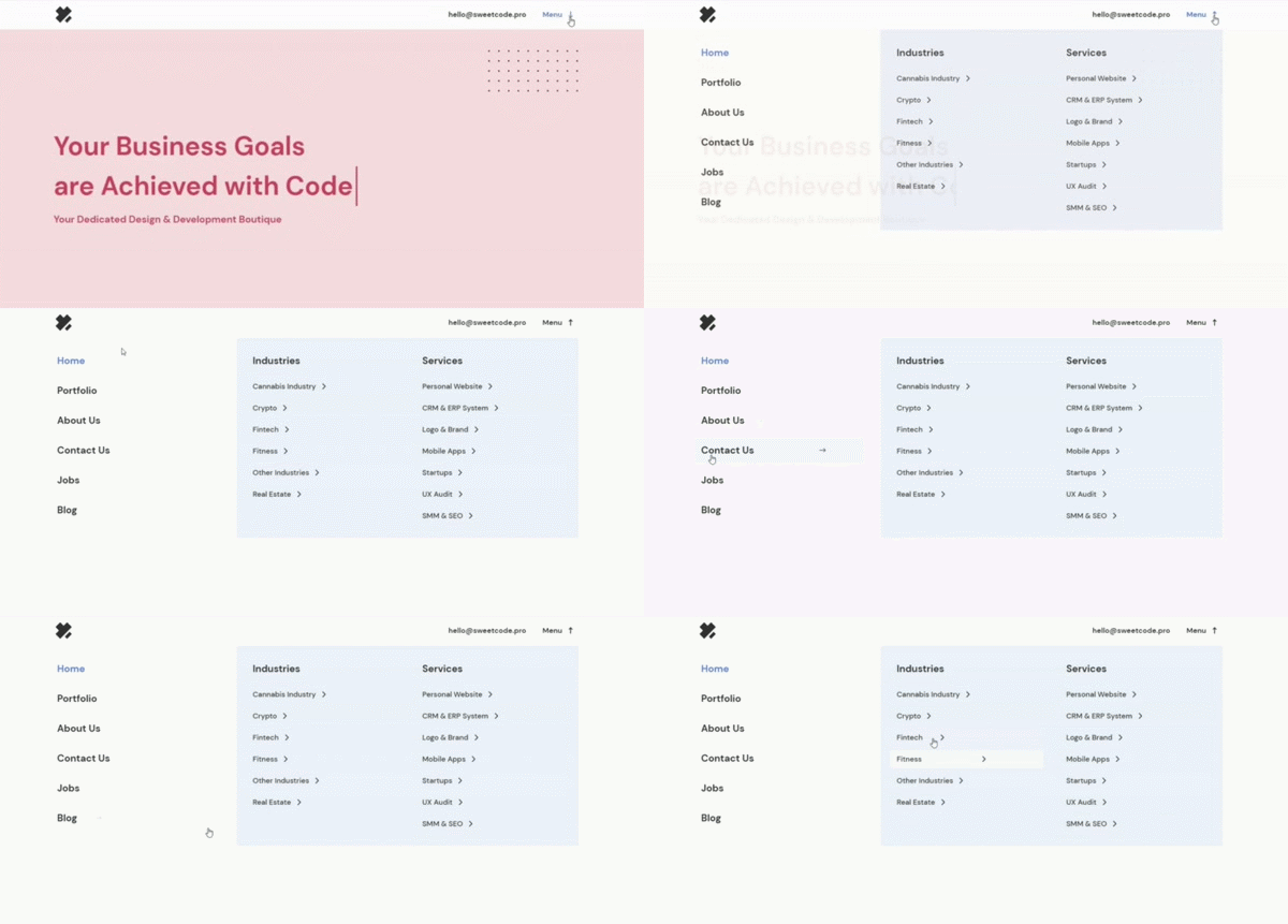
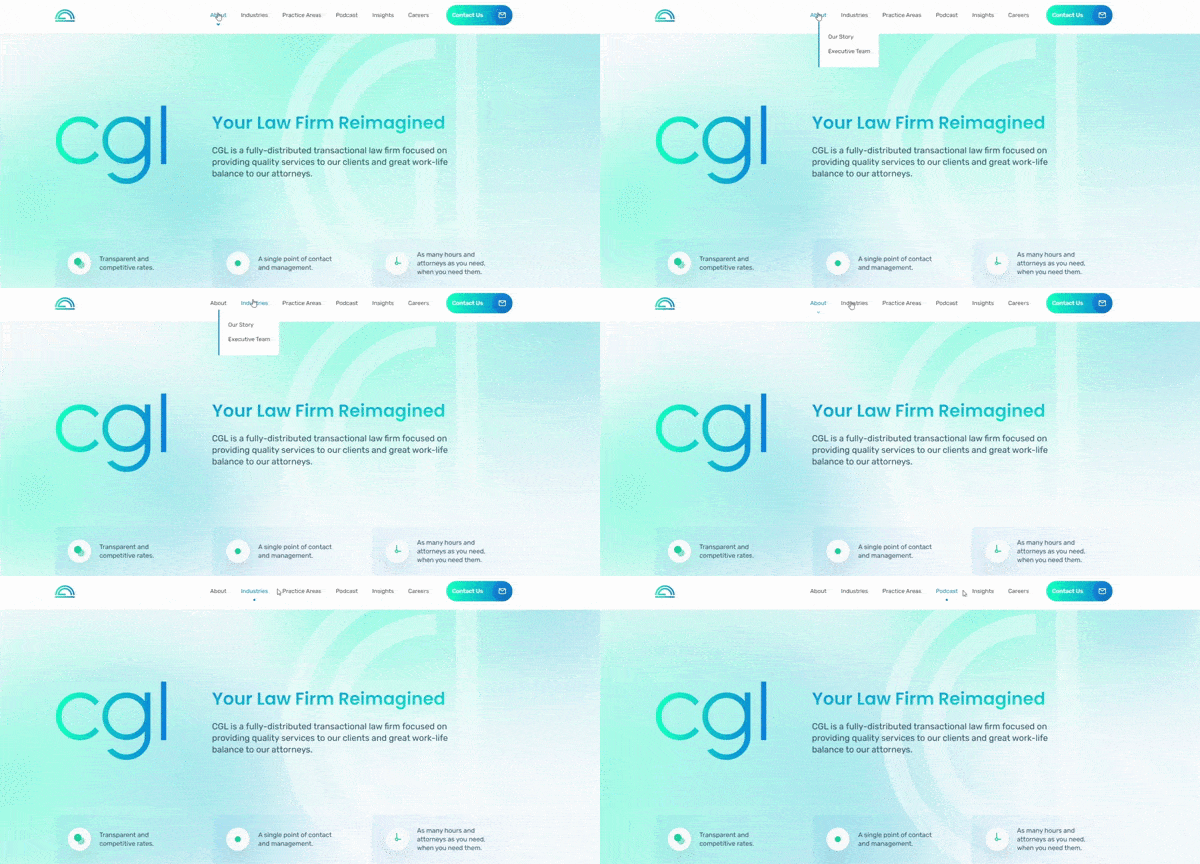
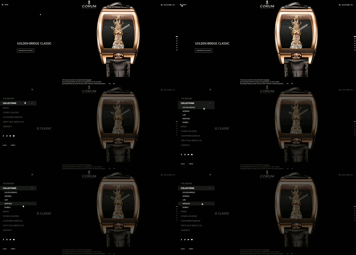
Little things make a big difference. And your website navigation is a great example. Because your brand must have an easy-to-use and smart design, and the first step is creating intelligent website navigation.
This article will look at some key aspects that we have learned from designing our website navigation over the years and share some tips and examples, and best principles.
What Is Website Navigation, and why is it important?
Navigation helps users quickly find stuff on your site and keeps them where you want. When it comes to the design process, navigation should be thought of from the very beginning.
Search engines use your website navigation to discover and index new pages. Links help search engines understand the content and context of the destination page and the relationships between pages.
Even more, navigation affects your website traffic: how high you will rank and how much traffic you can get from search.
Conversions: the percentage of visitors converted into leads and customers depends on how easy and enjoyable the site was to use.
For example, your potential customer is shopping for new jeans, so they come to an e-commerce website selling clothes. At this stage, your customer has to find their way from the landing page to the jeans selection. The navigation menu has to show them the right direction. Ideally, this process should happen quickly, in just 3 clicks.
Basic principles of website navigation:
Design excellent navigation isn’t so tricky, but one should need to grasp the following basic principles.
– Simplicity
It will help if you avoid unnecessary noise. You don’t need to have too many items in the main menu or distract the user’s attention. Better think about prioritizing the information, then marking it specifically without too much fuss. Generally, don’t go beyond the limit of more than 8 items.
– Easy to find
Users should be able to find the navigation menu easily and at first sight. The navigation text should be prominent and conspicuous. What’s more, the navigation area needs to maintain a specific size, and it should be placed at the top of the page or the right side.
– Hierarchy
To create a well-designed navigation menu, you must first list the menu tags’ hierarchy of information. List everything and try to make logical, fast, easy-to-understand labels for everything in the menu.

– Responsive Menu
If your website navigation doesn’t render appropriately on mobile, you’re in trouble. The best website navigation is universal, and responsive design supports versatility. No matter how the user accesses the navigation menu, the experience should be the same.
– Ergonomics
Navigation links on a mobile website need to be large and clear enough to be used with “one thumb and one eye,” as Luke Wroblewski asserts in his book Mobile First. In its “User Experience Guidelines,” Apple advises making anything tappable the size of a fingertip, which it defines as 44 points square, or approximately 57 pixels square.
There are some popular ways to organize the navigation you can always use it on your website.
Horizontal Menu
The Horizontal navigation menu is one of the basic and popular ways. The navigational menu bar sits across the top of the website with your primary web pages listed.
Tip: Please don’t use too many menu pages in your navigation because our short-term memory can only hold seven items.

Vertical Navigation
Vertical menus are not suitable for every website. Research shows that people naturally read from left to right, are more likely to view horizontally, and click on the screen’s right side. So please be aware that the vertical menu may confuse some visitors.

Hamburger Menu
Created by Xerox product designer Norm Cox in 1981, the hamburger icon was originally designed to indicate a Xerox system list. Nowadays, the hamburger menu is a compact solution often seen on mobile responsive websites.

Centered layout Navigation
It is well known for providing lots of free space for its owner to maneuver.
We hope this guide helps you navigate the complex world of website navigation. Whether you are developing a brand from the ground or looking to improve your existing business, smart, clean, and understandable website navigation will be a crucial part of your success.
Also, it would be best if you take your navigation work well for both users and search engine robots. Your Analytics will thank you for it!
If you need quality web navigation designed– send us an email to hello@sweetcode.pro.
